

Okay, welcome again! Have you managed to download and install R and R Studio? Let me know if you need any help! Let’s get to it then:
Click the little button on the top left corner that has a plus sign in front of a blank paper and create a new R Markdown document.
Select “Document”, give it a title “Learning R”, fill in your desired author information and check “use current date when rendering document”. For the default output select “html” for the moment (all my code is optimized for web deployment, so there may be issues when rendering something for a PDF or Word”). Hit “Ok”.
You have a new R Markdown document now! It is the preferred solution over using the “console” because you can make sure that all your progress is saved and you do not have to recreate an error that you generated three days ago not really knowing how. Plus it is much easier to share with others :)
Let’s install three critically important packages that we will use throughout this journey (use the console for this)1:
install.packages(“ggplot2”)
install.packages(“tidyverse”)
install.packages(“readr”)2
Delete everything in your Markdown document except for the first few lines from --- to ---.
Insert a new chunk (top right corner of your markdown field, green button with a white c and a plus on it). Below ‘‘‘{r} write library(ggplot2), then in a new line library(tidyverse), and in yet another line library(readr).
Hit the little play symbol on the right side of your code chunk.
Here is where we *should* be:
Okay, we are going places - time for a coffee break :) If you are stuck anywhere, always reach out to me. Also, Google is my superpower - if I do not know how to proceed it is a game changer to know what query might help you find others who were stuck in the same place.
Now, let’s start working with data! While there are a bunch of packages out there with varying versions of data I decided to use a comparatively small and independent3 set to start us off with: https://archive.ics.uci.edu/ml/machine-learning-databases/forest-fires/ and https://github.com/punkfanalex/risingtides/blob/main/forestfires.csv (use the latter if you want to follow this blog, I will be posting all datasets used there and occasional full markdowns for subscribers).
Once you have the data downloaded it is time to import it into our R Studio environment.
For that locate the top right side of your screen and select Import Dataset (should be an option so long as you are in the “Environment” tab).
Select “From Text (readr)”. Now browse for the file you just downloaded. You should see a preview of the table we are about to import4.
ReadR allows you to select which columns you want to import and what type they ought to be. We would like to keep “month”, and “day” as character variables (click “X” and “Y” columns and select “skip” from the dropdown).
Skip the following four columns and keep everything after and including “temp” as is (should be set to “double” for the variable type).
On the bottom right side you should see “Code Preview” - copy anything that comes below the first line (should be “library(readr)”). Then hit Import.
A new window opens on the left hand side of the screen with the table that you just imported (should be 7 columns and 517 entries).
Navigate back to your markdown tab (should be “Untitled1*” next to your table tab right below the navigation ribbon). Below the last line of your first chunk of code (should be “library(readr)”) paste what we just copied to our clipboard in step 5. For now, we will not need the View(forestfires) line, so you can remove that as well.
Cool, still with me? Here is where we are at:
Alright, let’s go back to the “forestfires” tab. Since the data we downloaded was developed by researchers at the University of Minho, Portugal, it is pretty save to assume that all our units are metric (if you are unsure always look for corresponding documentations when you download data from anywhere). At least for temperature that seems inconvenient for our purposes. Let’s start with introducing a new column for temp_in_F (we could also replace the existing “temp” column but I will save that for later).
Navigate back to the untitled markdown and insert a new chunk of code (below the now finished chunk ending with the .csv import).
If you have not changed the name of the imported dataset “forestfires” write forestfires$temp_in_f<-forestfires$temp*9/5+32 and hit the play button on the right side.
Navigate to the forestfires table again and you should notice that there is a new variable named “temp_in_f”!
Good job, we are going places. Now let’s finally get to visualize5.
Insert a chunk below the one that defines the Temperature in Fahrenheit. We want to use ggplot for this (trust me, it is by far the most powerful and intuitive package for visualizations in R). Full documentation for this is found here: https://ggplot2.tidyverse.org
The way it works is simple: You define which dataset you want to work with, what type of visualization you want, and finally edit layout and themes. Example? Let’s go!
The base function to call on ggplot is… ggplot! So we write ggplot(data=forestfires). But wait - we should decide on what we want to visualize first, ha! Okay - how about Temperature and Humidity? That sounds like a scattergram, doesn’t it? Let’s restart then! Important hint: ggplot connects with a simple “+” in between functions, super easy :)
ggplot(data=forestfires)
geom_point() (geom_point is the corresponding function for scattergrams).
Every type of visualization (i.e. scattergram, distribution, boxplot) has its own requirements for defined variable. For a scattergram we need at least and x and a y-variable. We can define those in the any part of the function (ggplot(…) or geom_point(…)). We said Temperature and Humidity right? Let’s have temp_in_f be on our x-axis and humidity on our y-axis. We write:
geom_point(mapping=aes(x=temp_in_f,y=RH)) and then hit play on the right hand side again.
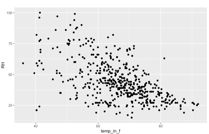
I deliberately cut off the code that created this visualization, you have all the pieces available, just connect them with a + ;).
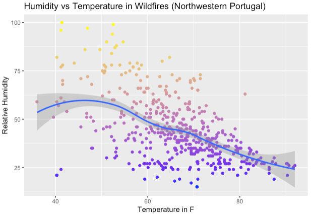
Alright, time for a moment of appreciation! You just created your first own visualization with R. Let’s briefly analyze: Apparently the colder it is, the higher the humidity. At least for wildfire areas in Northwest Portugal. Of course we have not done any actual statistical analysis, so I would personally be very careful with a claim like that. Also realize that relative humidity directly responds to temperature. Regardless, we can certainly *see* a trend, and sometimes that is what’s needed.
I will leave it here for now and let you play around with what we have. Please consider subscribing. This intro post serves to pick you up, other subscriber-only posts will go much more in-depth of how to build visualizations like those I posted to risingtides.quarto.pub. Reach out with any questions you may have, I am excited to get this journey started and have you join us! Stay tuned for round 2 :)
~Alex
P.S.: Here’s what lesson 2 will hopefully get us to graphic wise:
There is something called the CRAN-repository - unless you are using self-developed functions (i.e. some sort of package someone build and published in GitHub) the install.packages function will be able to locate and install the desired package.
Technically, this is part of the tidyverse, but I have run into deployment issues before and prefer installing both packages separately. ReadR is used to import csv files and such, find the full documentation here: https://readr.tidyverse.org
Cortez, Morais (2008)
Maybe a word about this dataset: It features a list of weather and intensity observations of wildfires in Northeastern Portugal. We will not care a whole lot about the more technical variables and instead focus on Temperature, Humidity, Wind, Rain, and Area variables.
Usually, we would begin conducting some basic analysis here using functions such as summary(df); I am skipping past that step here to keep this post to reasonable length.